
Why FlexBox?
It aims at providing a more efficient way to lay out, align and distribute space among items in a container even in case of dynamic sizing. So we can easily arrange our elements through the flex properties.
Flex Properties
The whole concept of flexbox is dependent on it’s amazing properties through that we can manage the different aspects of design.
Parent Properties i.e Flex Container Properties
Display: This defines a flex container. It enables a flex context for all its direct children. To make a container we need to set display as flex or inline flex.
.container {
  display: flex; /* or inline-flex */
}
Flex Direction: This defines axis on which the flex container elements are placed which can either be horizontal and vertical.
.container {
  `flex-direction: row | column | row-reverse | column-reverse;
}
Row(default) : Left to Right { Reverse: Vice Versa }
Column: Top to bottom { Reverse: Vice Versa }
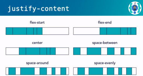
Justify Content: This defines the alignment along the main axis. It helps distribute extra free space leftover. It also helps in managing the alignment of items in case of overflow.
.container {
  justify-content: flex-start | flex-end | center | space-between |
    space-around | space-evenly | start | end | left | right;
}
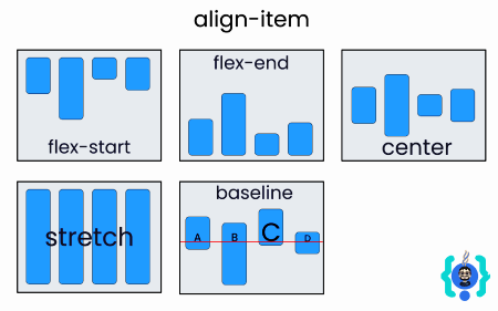
Align Items: This defines the default behavior for how flex items are aligned along the cross axis. Think of it as the justify-content version for the cross-axis (perpendicular to the main-axis).
.container {
  align-items: stretch | flex-start | flex-end | center | baseline | first
    baseline | last baseline | start | end | self-start | self-end;
}
Align Content: This aligns a flex container’s lines when there is extra space in the cross-axis, similar to how justify-content aligns individual items within the main-axis.
.container {
  align-content: flex-start | flex-end | center | space-between | space-around
    | space-evenly | stretch | start | end | baseline | first baseline | last
    baseline;
}
Children Properties i.e Flex Items Properties
Order: The order property controls the order in which the flex items appear in the flex container.
Flex Grow: This defines the ability for a flex item to grow if necessary. It accepts a unitless value that serves as a proportion in which they distribute space among them. By default flex-grow is set to 1, if we set it as 2 the item will take twice the space in comparison to others.
Flex Shrink: It allows a flex-item to shrink up in space if required.
Flex Basis: This defines the default size of an element before the remaining space is distributed.
Flex: It is a flex shorthand property which combines
flex-grow,flex-shrinkandflex-basistogether. flex-grow is mandatory value while other two are optional..item {
flex: none | [ < "flex-grow" > < "flex-shrink" >? || < "flex-basis" > ];
}Align Self: Using this we can align and individual item inside a flex container.
.item {
  align-self: auto | flex-start | flex-end | center | baseline | stretch;
}